DTF: Social Well-Being Mobile App
At UX Fest SLO, our team of four designers participated in a hackathon alongside 20+ teams. Over the course of a weekend, we collaborated on DTF (Down to Find) within a 36-hour timeframe and after being selected pitched to a panel of judges, which earned us a spot as the Final 5.
Tools Used: Figma, Pen + Paper
Duration: 36 hour sprint | Winter 2022
Role: UX/UI Designer
Team Members: Marissa Thai, Han Wong, Fred Pastrana, and Masa Nagano
Project Overview
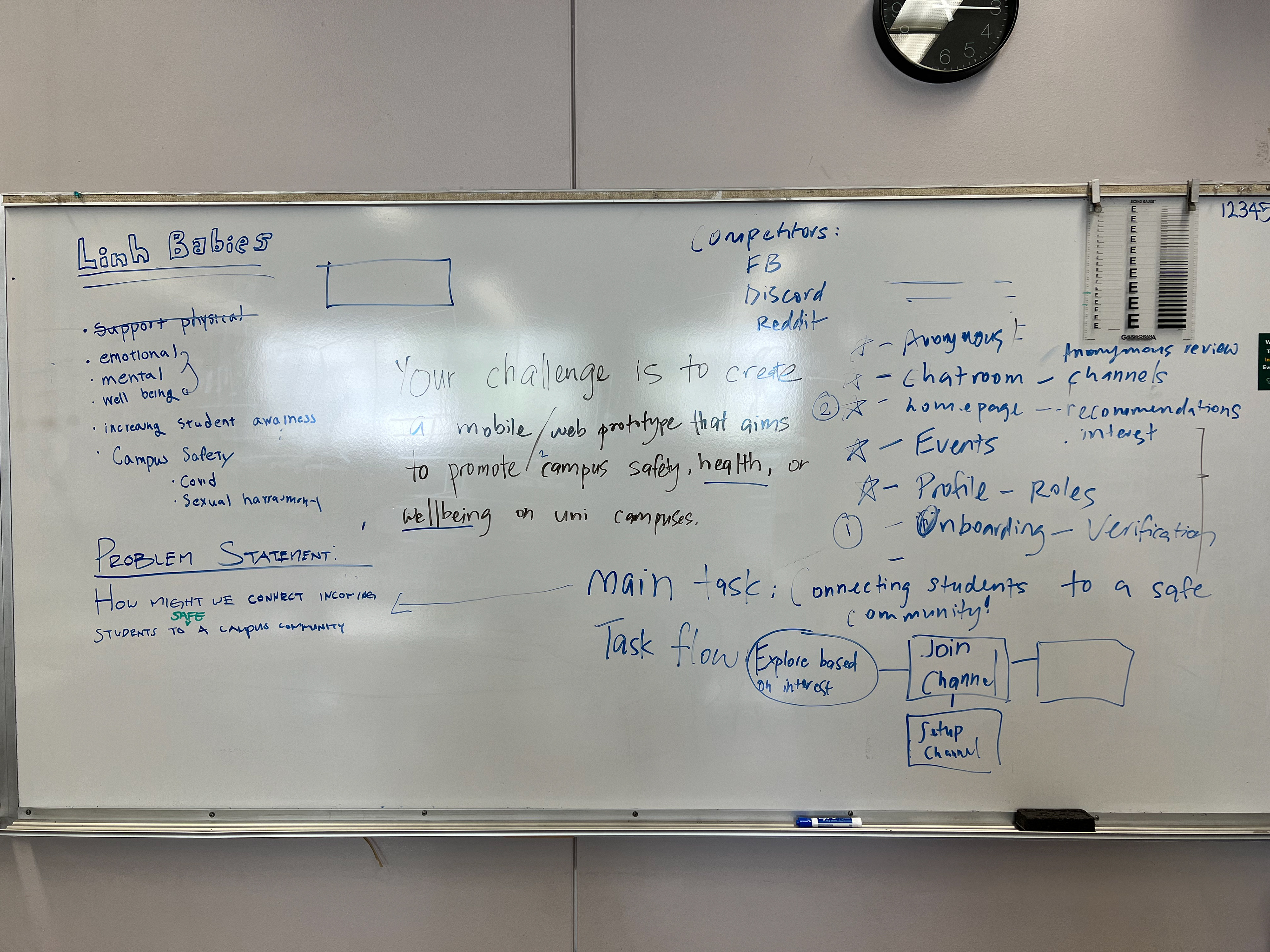
💬 Prompt
Create a mobile or web prototype that aims to promote campus safety and well being on university campuses.
🫡 Our Solution: Are you Down to Find?
DTF is a private community platform for college students and faculty to chat in a safe and welcoming space. During the COVID-19 pandemic, it was hard for students, such as freshmen and transfer students, to socialize and connect with other students.
My team and I created a platform students can connect to their club members and classmates safely.
Check out the prototype!
Hit fullscreen for ✨ optimal experience ✨
Documentation
🤔 Ideation
Following the prompt announcement, our team opted to concentrate on enhancing campus well-being. We began brainstorming various concepts that could positively impact student well-being and ideating ways our app could address these issues.
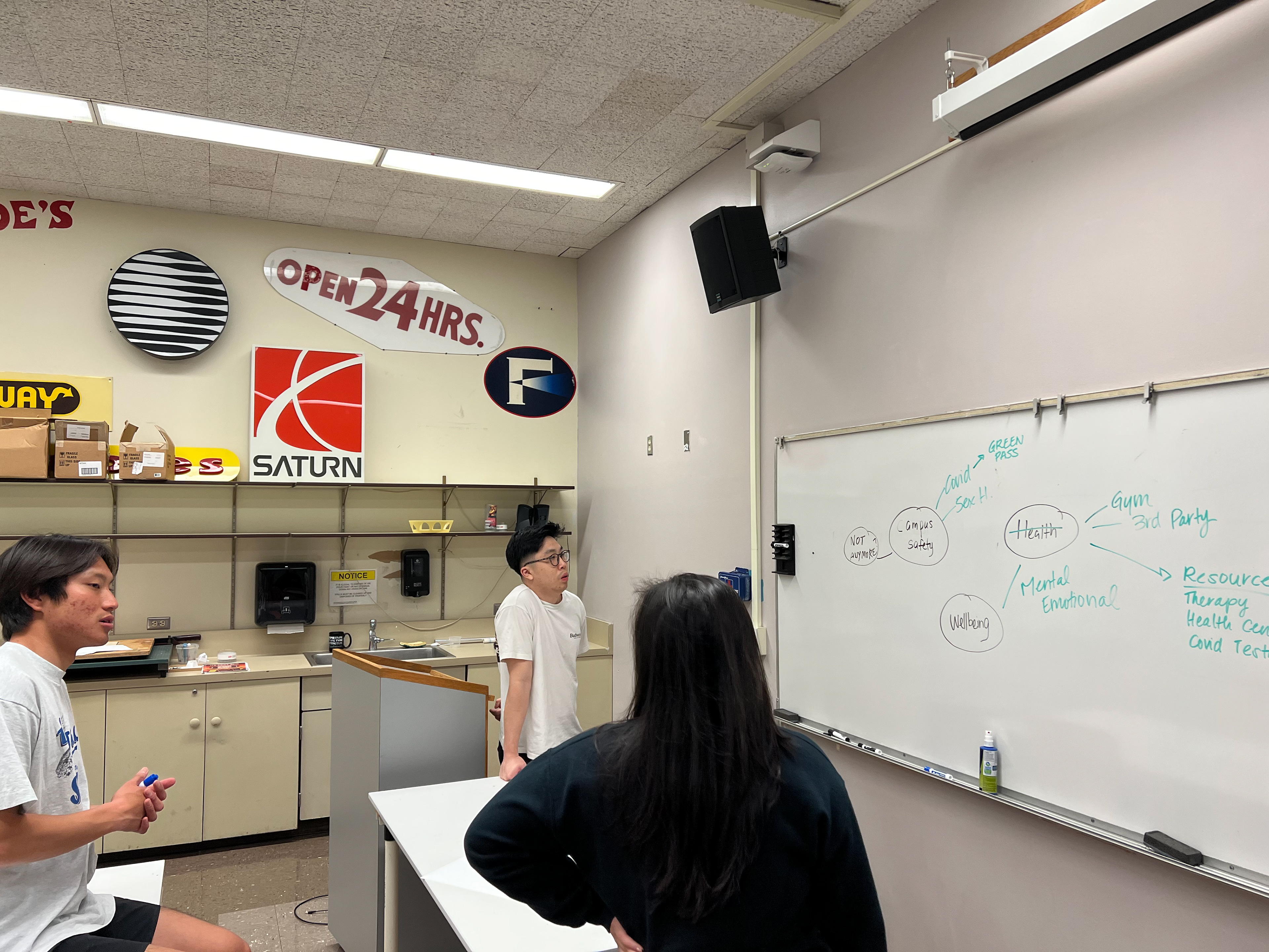
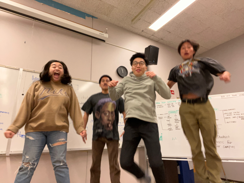
the dream team! ft. Masa, Han, & Marissa (Fred was behind the camera)
skeleton of DTF
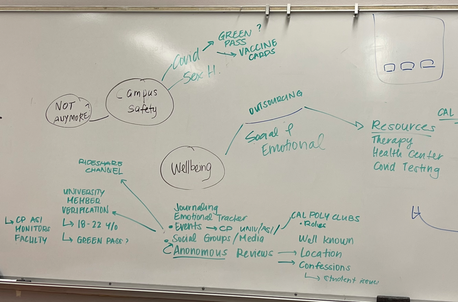
our brain vomit at 10 pm
the ✨ vision board ✨
📞 Reaching Out
Navigating a safe and inclusive community on campus poses a significant challenge for college students, particularly freshmen and transfers. To better understand their social experiences during the pandemic, we reached out to several individuals who fit that category. Granted, it was whoever was available to talk to us on a late Saturday-night early-Sunday-morning 🥹
📊 Analysis
Through these discussions, (shout out to them for picking up our facetimes and texts btw!) we identified commonalities in the apps they use for socializing. Following this, we created a ✨ competitor analysis ✨ to gain insights into effective tactics and potential areas for improvement.
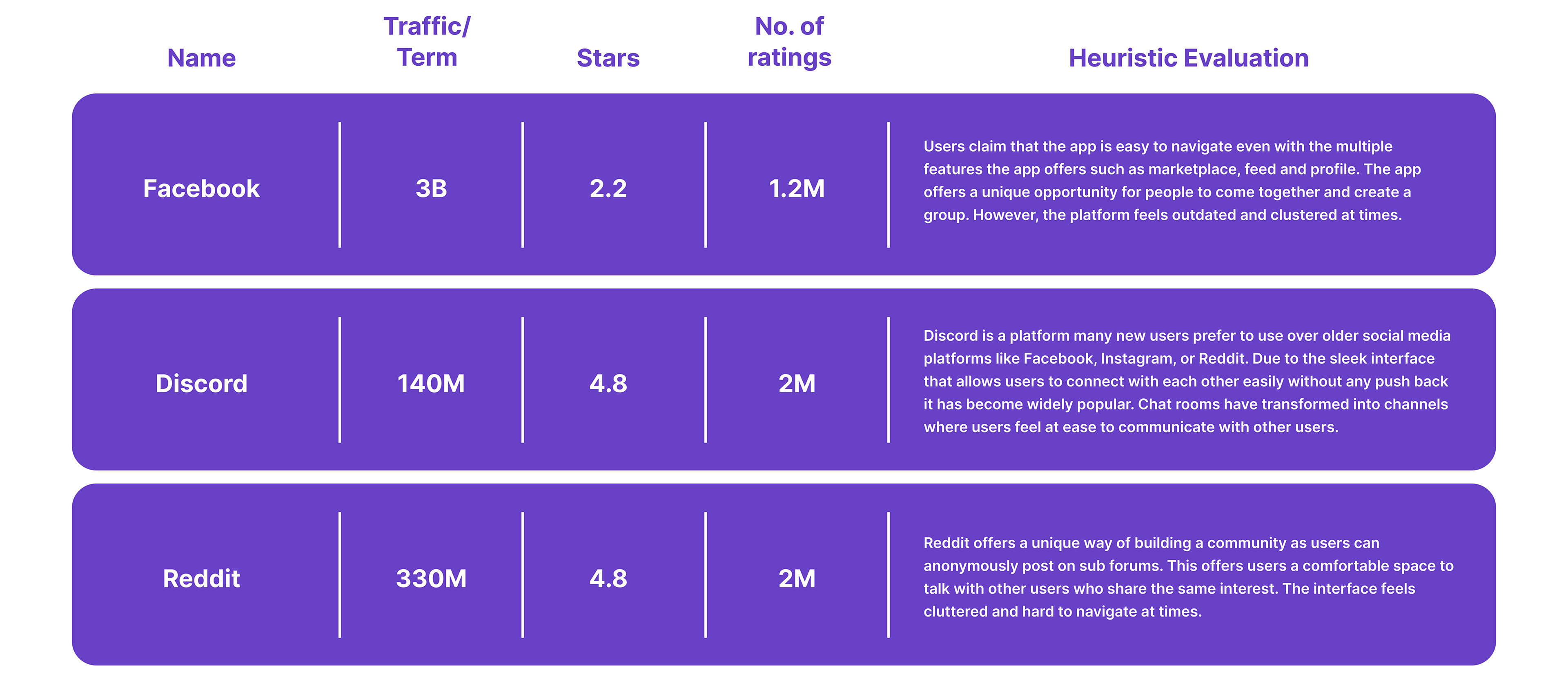
Competitor Analysis Chart
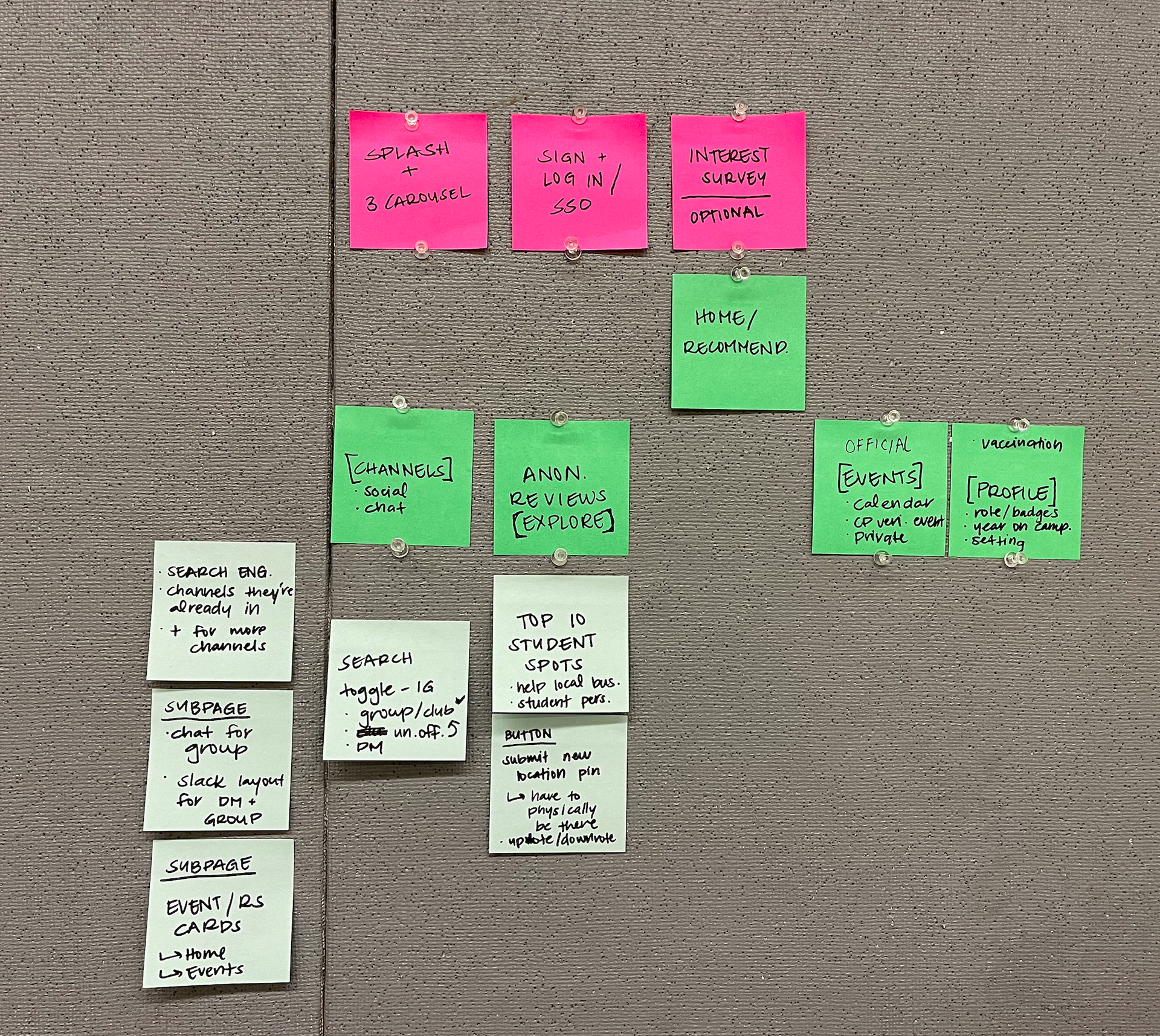
During our brainstorm session, we expanded upon the features we envisioned for the app, refining our vision through collaborative discussions. This process allowed us to establish a comprehensive list of functionalities to enhance the user experience. With a clear understanding of the the desired features, we then crafted the app's flow, mapping out a ✨ user journey ✨
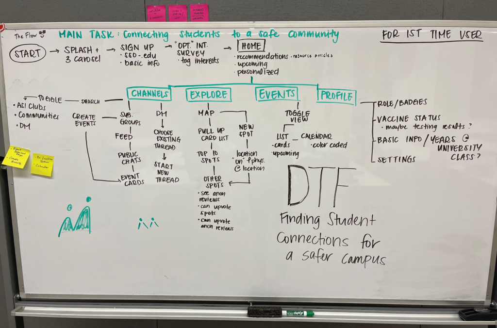
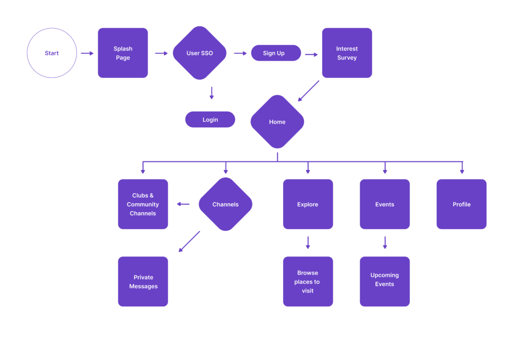
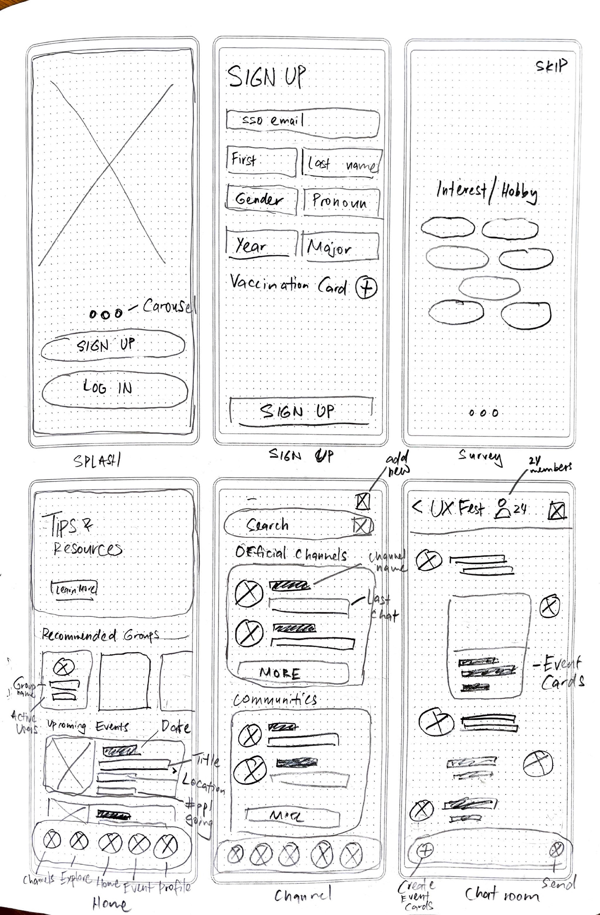
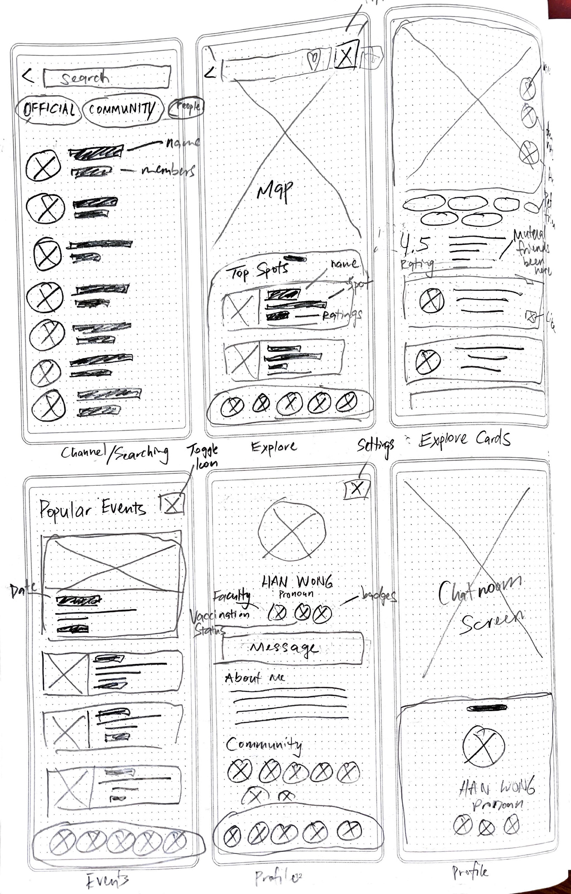
✍🏼 Wireframe Sketches
Having finalized the user journey map, we proceeded to sketch wireframes and develop a design system to maintain consistency across the app's interface.
Opting for efficiency in our 36 hour sprint, we discovered a pre-existing components library that aligned with our preferences. Making slight adjustments to accommodate our app's branding, we seamlessly integrated these components into our final solution.
💪🏼 My Contribution
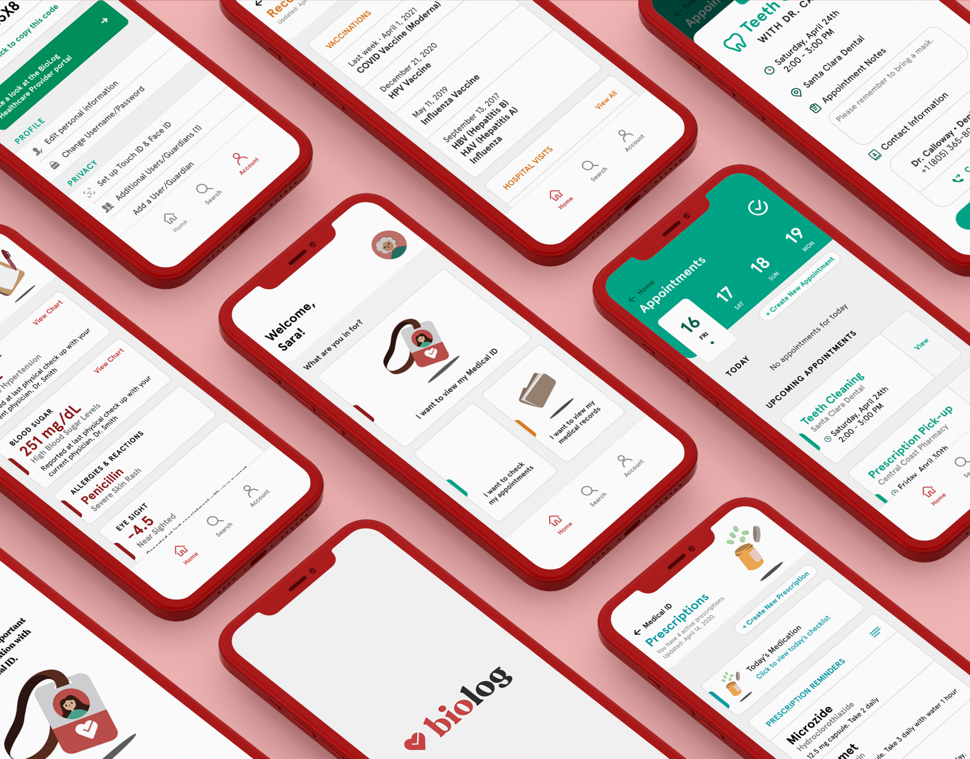
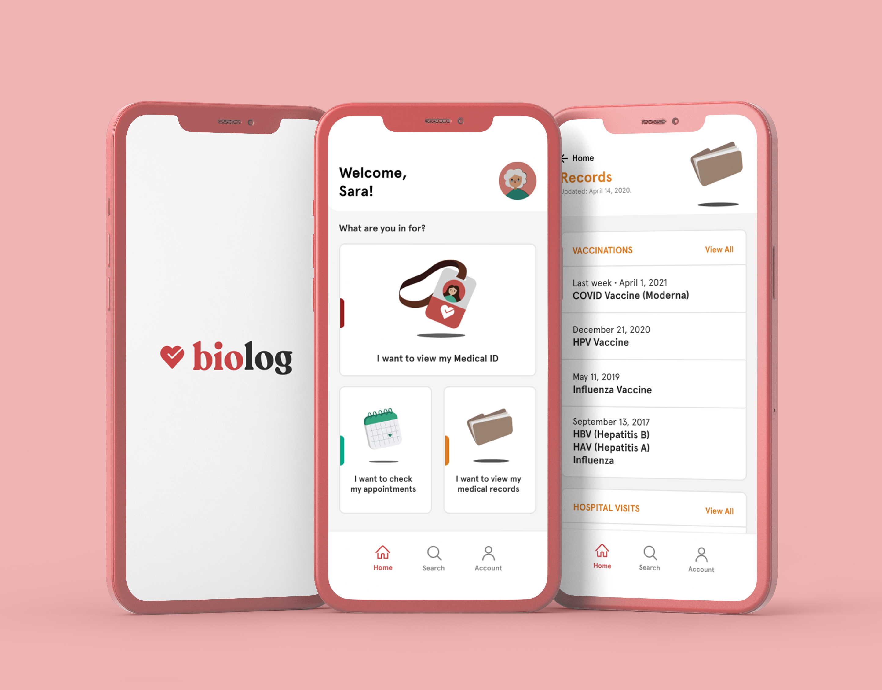
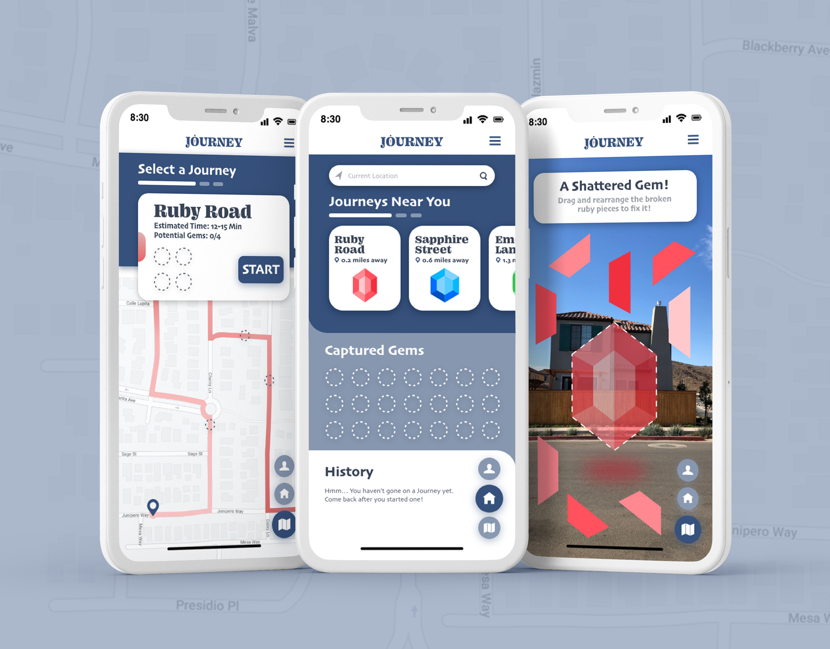
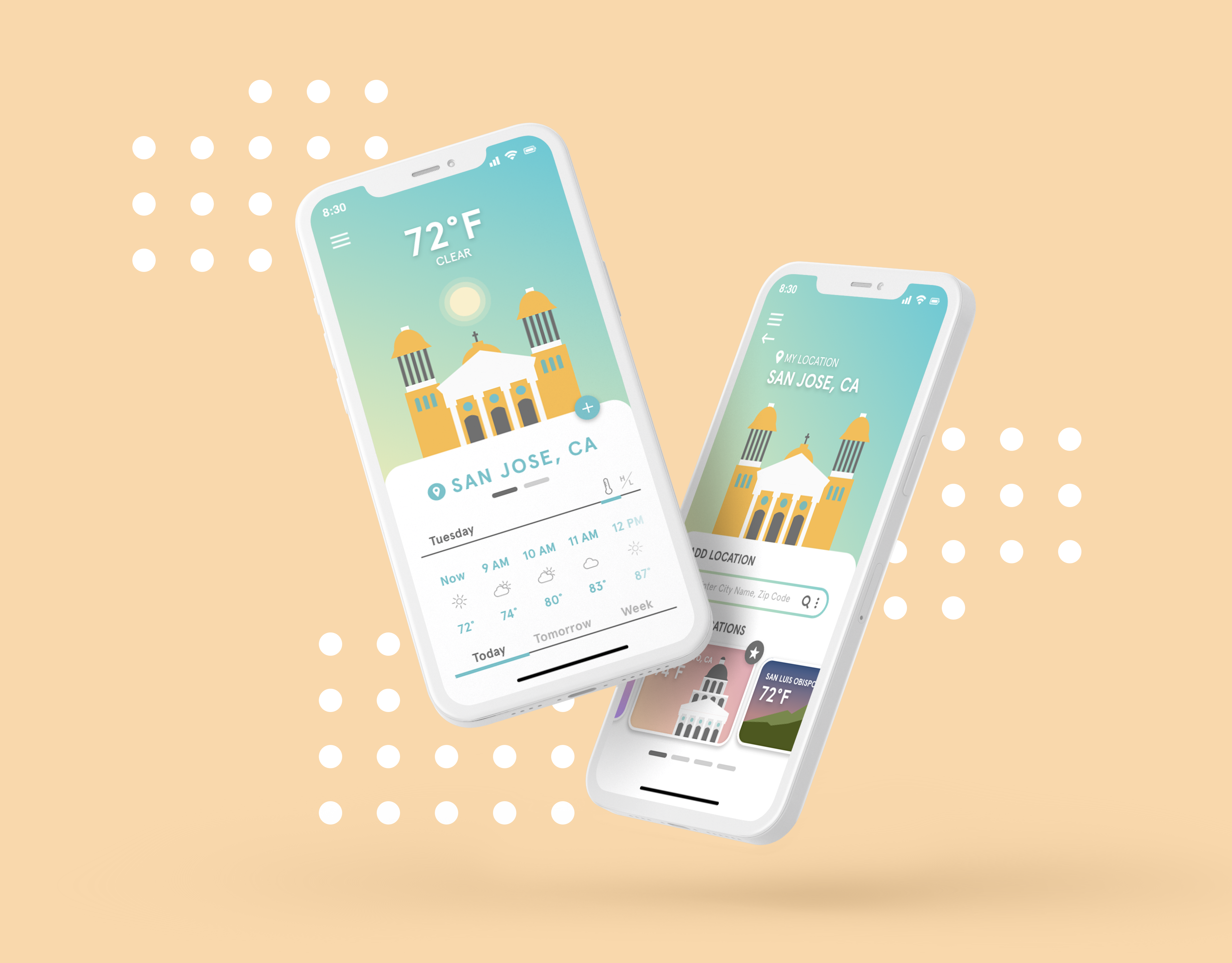
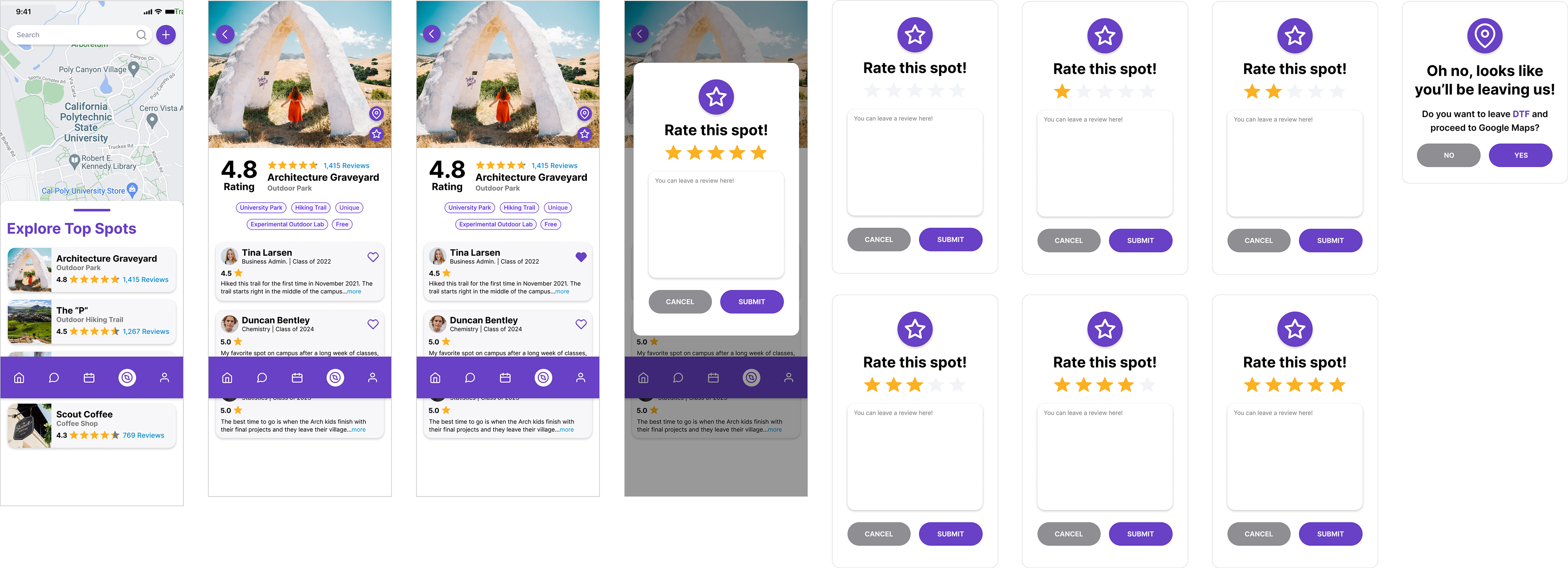
During the design phase of the night, each designer chose a specific feature to focus on. I designed the Explore/Map feature, which entailed creating a Yelp-inspired search and discovery interface. This feature enables users to explore local favorite spots recommended and vetted by current upperclassmen, alumni, and university faculty.
Using small components like chips for tagging locations, users can filter or determine if a spot aligns with their social preferences. Additionally, I designed a rating overlay feature to provide authentic feedback from users, further enhancing the credibility of each location.
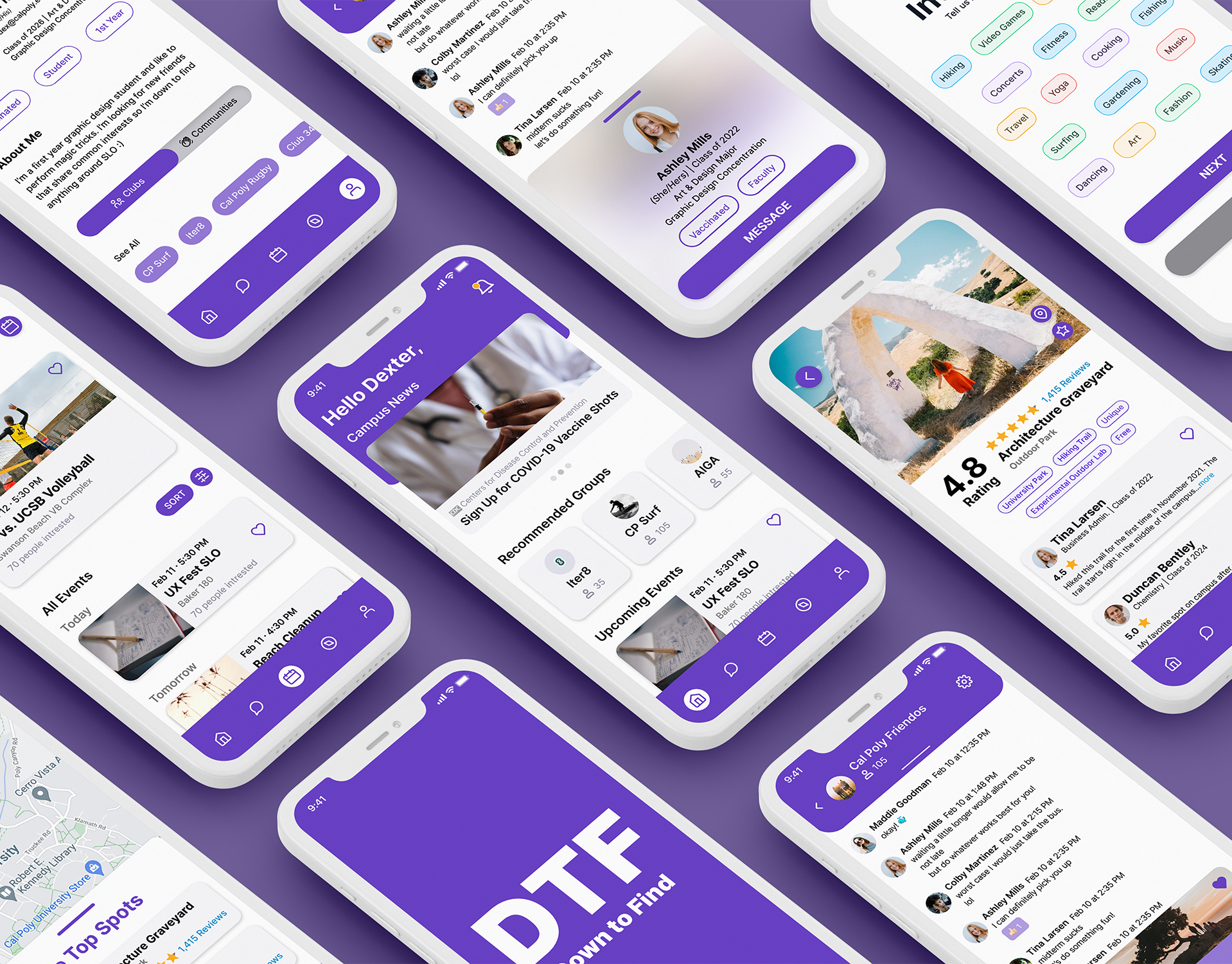
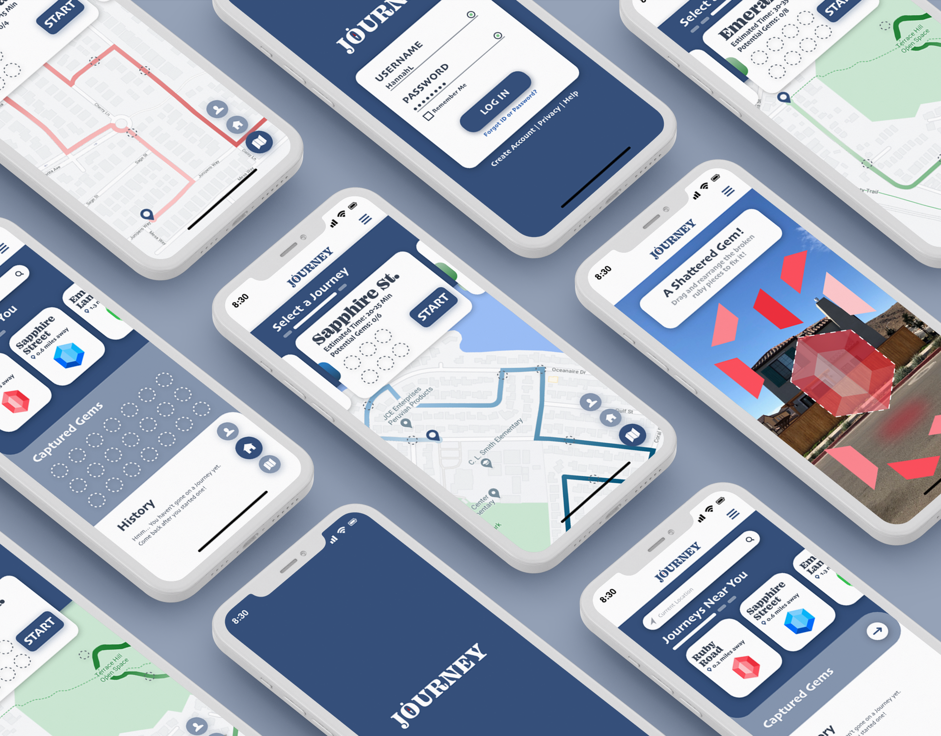
DTF screen examples
Looking back...
The objective of this app is to help students, specifically freshmen and transferred students, to connect with the campus community and maximize their college experience.
Based on the feedback we received from the judges, we analyzed that our product focuses on too many things while successfully tackling none. We realized that our product’s numerous features have blurred the product’s main goal: to promote well-being on campus. From this valuable experience, we learned the importance of consistently revisiting the problem the product aims to solve throughout the project development process.
Thanks for reading, you earned a jump scare! — Linh's Babies (2022)